So I have a Jio Fiber at home. When I had to add new mobile devices to the Wifi it was easy, use the Share password feature on every phone and let the new phone scan it.
Easy
However, this was not possible as i got a new Windows Laptop, I could not Scan the code and some Android phones do not display the password.
I thought it will be easy, I can just login to the Router Admin URL and view the password and type it in my laptop.
To my surprise, I can only CHANGE password from the router admin Not View already set password.
Now, Just to setup 1 new device, I have Only 1 option.
Create a new password which disconnects all devices, the device that I am using as well and then Add All Devices again to the same network.
Going to Jio support was of no help, the robots designed to keep human support away just told me instructions on how to change password.
Category: Bad UX
-
Jio Fiber Usability Issue can not view password
-

Dark Pattern at Quora.com
The Email from Quora
So as usual Quora does, i got an email, if i can answer “X” question because i answered “Y” related question, years ago.
I clicked on it with the intention to unsubscribe. When i clicked on the link, i was auto-logged in.
Hmm… that was smart and efficient. I don’t have to remember my password and the login steps are out of the way. Then i decided to log out.
How do i log-out ?
As the typical universal pattern for Log Out / Setting and Option goes
- i clicked on my profile picture.
- scanned, for log out.
- did not find it.
- closed the profile call-out.
- scanned elsewhere
Can you take this quick test ?
In 5 Seconds, find out how to logout.
IMP: Get into a User mode and not a Designer Or Critic Mode.

Quora Landing Page 
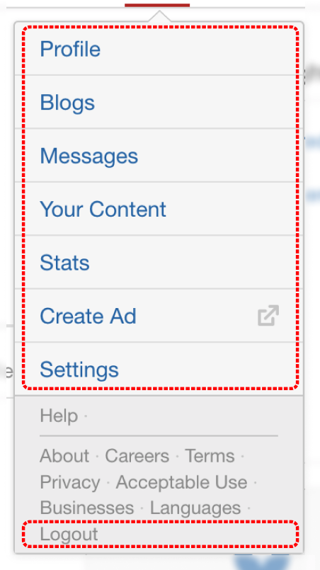
Quora.com Profile Callout
(smaller version for mobile)This is very well crafted design, by intent the Business doesn’t want to dissuade the user from logging out.
Observations
As for any user, it would be really difficult to find the log-out link.
The Dark Pattern Rises
I was almost convinced that logout link is not in this call out. But, i was committed to logout, i tried to find other places on the header…. Still nothing.
So i clicked it on the profile picture again, and scanned each text carefully.
There it was. Intentionally demoted visually.
Quora Logout Dark Pattern 
Quora.com Profile Callout
(smaller version for mobile)So from an Information Perspective, Quora does know that it’s important for users to find log-out link.
But it doesn’t want the user to find it easily. So they cheat the hierarchy.I also quickly checked few of the popular software’s and sites for similar task. And they have it very clear.
Other Popular Sites
Reflecting
I even thought that this was not a dark pattern, but it was indeed done with good intent. Intent with an assumption that user would not want to logout… But then, the answer would be simple, if user does not intend to logout, he’d not initiate that action.
When Business Triumphs user needs
This is what happens when Business need is forced over the user. Some product manager is given a metric to chase, say.
– How many authenticated users per month ?Quora is not alone
I’m not frequent on Quora. But I am frequent on LinkedIn and LinkedIn has a ton of dark patterns. Probably for some other blog post (it will need a series)
Fact: I did not actually logout there, but the Designer within me prompted me to write this post. Oh we designers.
What if I was asked to design this ?
Its easy to criticize sitting switching tabs in browser. Enough designers do that already. What would i have done if i was the designer and PM/Business head came to me asking to get X metric.
I think i would start with a “5 Whys” , maybe a few more whys to determine root cause / intent of the PM/Business head and then suggest an alternative which wont be a dark pattern.
-

Twitter.com User Experience viewing images is difficult
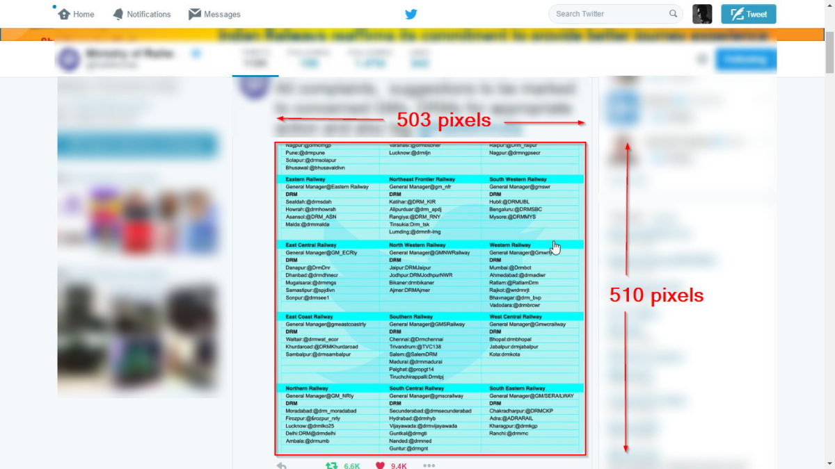
You are browsing Twitter.com and see an interesting image. So you just click on the image / media to view it larger. As you can see in the image, the size is 503 pixels by 510 pixels, above screen-shot was taken in Full Screen mode.
-

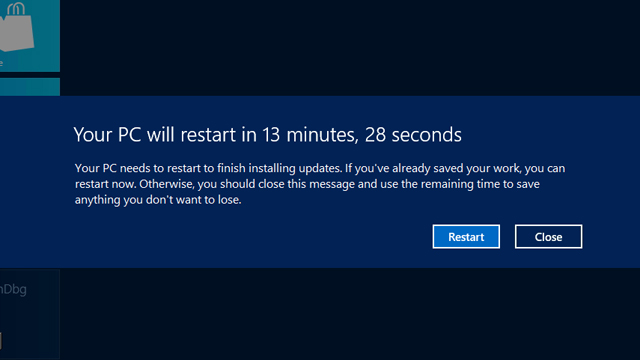
What does Microsoft think about Heuristic “User Control & Freedom”, they don’t
My recent exposure to Microsoft’s take on the heuristic “User Control and Freedom”, which essentially says, Don’t give users control and freedom. No control on updates and forced re-starts. (more…)


