Usage of dark patterns by payments app PayTM as documented by The Ken Web. Details in twitter thread below.
As the Data Protection bills come to light, Dark Patterns must also be banned in India.
Usage of dark patterns by payments app PayTM as documented by The Ken Web. Details in twitter thread below.
As the Data Protection bills come to light, Dark Patterns must also be banned in India.

So I checked the Amazon app after a few months. Just for reference, Amazon App Logo changed from this to this.
At first I was looking for the old Amazon logo by memory, after finding no results, i realized, the logo has changed.

What got me irrirated was the splash screen was now full lenght screen. With no way out for the user.
Look at the full screen below
Turns out they’ve force you to choose a Prime plan. There is no way to exit the flow. Youur only option is to close and restart the app.
Now imagine users who don’t know restart is an exit route.
Implications
This is what happens when unethical and immoral business requirements enforce a user experience against the user needs/wants.
How to get rid of this
Businesses with the technology and monopoly would always have control and dicatate what their users can and can not get. In my understanding regulation is the only way to tackle this. I am not sure if such dark patterns are covered in the regulations like this California ban on dark patterns. If not, it should. Such regulations are a good starting point.
Update
So i checked the amazon app again yesterday and was pleasantly surprised that they have updated the splash screen to make it more explicit and made the options to continue without forcing to signup for prime.
Apart from the actions, we can see clear description in text on what the user can expect.

#darkpatterns

So as usual Quora does, i got an email, if i can answer “X” question because i answered “Y” related question, years ago.
I clicked on it with the intention to unsubscribe. When i clicked on the link, i was auto-logged in.
Hmm… that was smart and efficient. I don’t have to remember my password and the login steps are out of the way. Then i decided to log out.
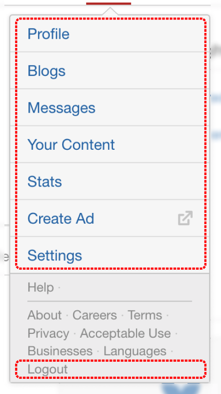
As the typical universal pattern for Log Out / Setting and Option goes
In 5 Seconds, find out how to logout.
IMP: Get into a User mode and not a Designer Or Critic Mode.


This is very well crafted design, by intent the Business doesn’t want to dissuade the user from logging out.
As for any user, it would be really difficult to find the log-out link.
The Dark Pattern Rises
I was almost convinced that logout link is not in this call out. But, i was committed to logout, i tried to find other places on the header…. Still nothing.
So i clicked it on the profile picture again, and scanned each text carefully.
There it was. Intentionally demoted visually.


So from an Information Perspective, Quora does know that it’s important for users to find log-out link.
But it doesn’t want the user to find it easily. So they cheat the hierarchy.
I also quickly checked few of the popular software’s and sites for similar task. And they have it very clear.
I even thought that this was not a dark pattern, but it was indeed done with good intent. Intent with an assumption that user would not want to logout… But then, the answer would be simple, if user does not intend to logout, he’d not initiate that action.
This is what happens when Business need is forced over the user. Some product manager is given a metric to chase, say.
– How many authenticated users per month ?
I’m not frequent on Quora. But I am frequent on LinkedIn and LinkedIn has a ton of dark patterns. Probably for some other blog post (it will need a series)
Fact: I did not actually logout there, but the Designer within me prompted me to write this post. Oh we designers.
Its easy to criticize sitting switching tabs in browser. Enough designers do that already. What would i have done if i was the designer and PM/Business head came to me asking to get X metric.
I think i would start with a “5 Whys” , maybe a few more whys to determine root cause / intent of the PM/Business head and then suggest an alternative which wont be a dark pattern.